

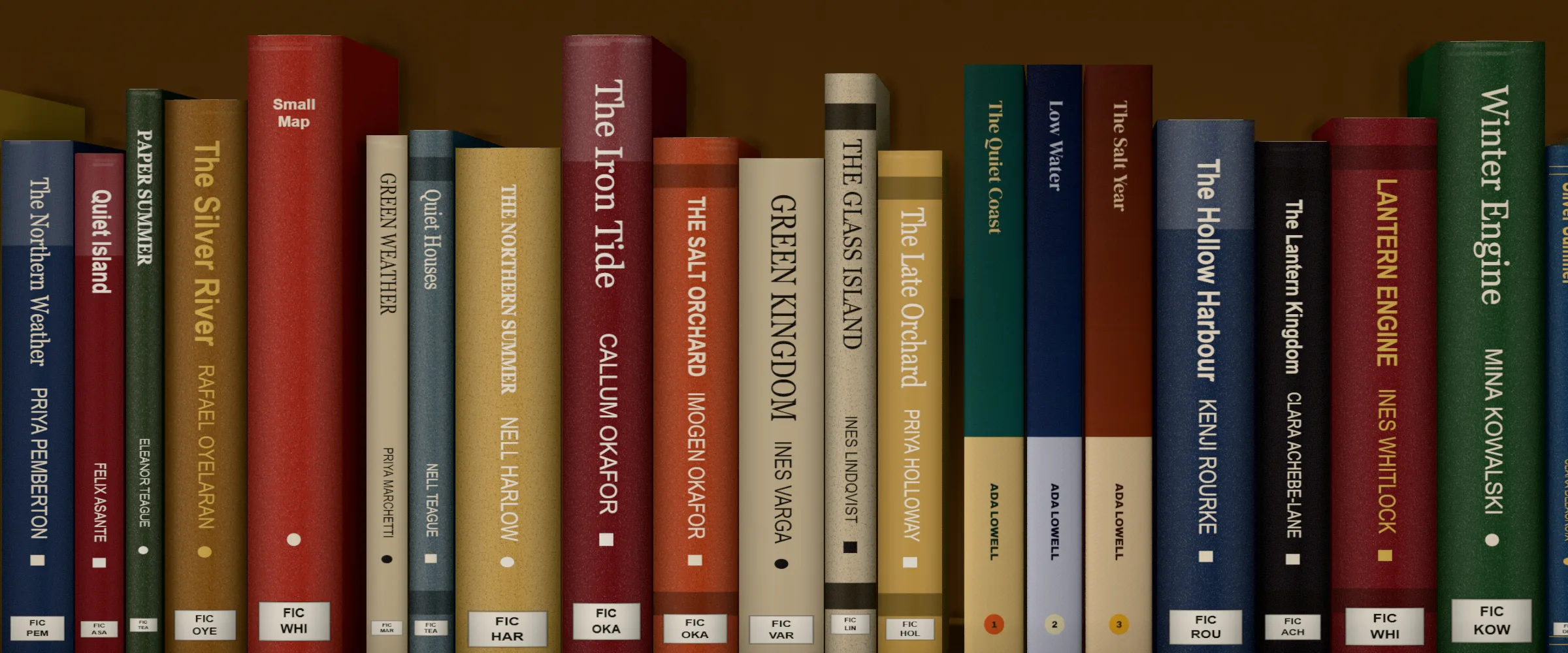

Your book spine matters because it’s usually the only part of your book a reader sees on a shelf, so it has to earn the first look before anyone touches the cover. At minimum, put the title and your name on it, with the title getting the most attention, and add a publisher logo if it matters for your book. Make it stand out from the books around it, and if you’re writing a series, make the spines match. If you self-publish, also get the width right, since it depends on your page count and paper.
If you’re still deciding how involved to be in your cover, start with “Should You Design Your Own Book Cover When You Self-Publish?”.
Why the spine matters more than you think
We tend to focus on the front cover, and for good reason: it sells the book. The back cover matters too, because that’s where readers get the details about the story.
But on a bookstore or library shelf, the spine is usually the only part of your book anyone can see. It sits between hundreds of other books, and it has to earn the reader’s attention before they ever touch the front cover. You can see how yours holds up by placing it in a bookshop scene or on a shelf.
Design for visibility first
The first goal is to stand out. Color and typography are the obvious tools, but the real task is finding a creative way to look different from everything next to you. Ask yourself:
- Would this spine catch my eye from across a room?
- Can I read the title in a second?
- Does it look different from the books on either side of it?
Put the title first, not your name
Every writer is proud of their book and wants their name written as large as possible on the spine. I’m guilty of this too. But unless you’re a household name, your name usually isn’t what sells the book.
If Stephen King’s name is on a spine, you barely need the title, because most people will pick it up anyway. Most of us aren’t Stephen King, so the title usually matters more than the author’s name. Give the title room to stand out, then add your name and, if it matters, a publisher name or logo.
If you’re writing a series, think about the whole shelf
If your book is part of a trilogy or series, picture all the books lined up together. Keep the font, colors, or imagery consistent so the set looks like a set.
As a reader, I hate it when the third or fourth book in a series suddenly changes its look or even its trim size. A shelf of matching spines is a small reward for readers who collect your books, and you can test the look with a 3D book mockup before you print.

Use the space you have: a spine that looks like a record
Spine width depends on the book’s thickness. A thicker book gives you more room to be creative.
My second book, Cover Stories: A Euphictional Anthology, was a short-story anthology I edited, with stories from ten writers. It was a big, thick book, which gave me a wide spine. I designed it to look like a vinyl record, with the label in the middle taking up most of the spine. Close up, you could see who edited the book, the names of all ten writers, and one story title per writer, laid out like the track listing on a record.

You don’t need a wide spine to be creative, but the extra space shows what’s possible.
Get the width right so nothing bleeds onto the cover
When you self-publish, you need to get the spine measurement exactly right, or text and artwork can spill onto the front or back cover.
Here’s what Amazon KDP, one of the most popular ways to print self-published paperbacks, requires:
- Spine width depends on page count and paper. On white paper, the spine measurement is the page count multiplied by 0.002252 inches; on cream paper, it’s the page count multiplied by 0.0025 inches. For example, a 300-page book works out to about 0.68″ on white paper or 0.75″ on cream.
- Your book needs enough pages for spine text. KDP requires at least 79 pages to include text on the spine, and it will reject a cover that has spine text on a shorter book. If you use KDP’s Cover Creator, the minimum is 80 pages.
- Leave a margin. Spine text must be sized to fit and needs at least 0.0625 inches (1.6 mm) of space between the text and the edge of the spine, because every book varies slightly when it’s bound.
- Your whole cover has to add up. KDP’s formula for total cover width is the bleed, plus the back cover, spine, and front cover widths, plus the bleed again.
You don’t have to do this math by hand. Use a spine width calculator, and read this guide to KDP spine width for details. You can find Amazon’s official rules in KDP’s paperback cover help page.
If you change your page count after designing the cover, or switch paper from white to cream, recalculate the spine before you upload.
Spine design checklist
- Is the title readable at a glance, from a distance?
- Does the spine look different from the books around it?
- Does your page count meet the minimum for spine text?
- Did you calculate the width from your final page count and paper type?
- Is there a safe margin between the text and the spine edges?
- If it’s a series, do all the spines match?